


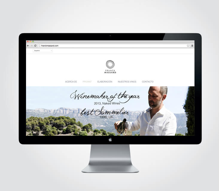
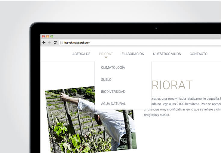
Franck Massard Winemaker / Sommelier Brand
Visual Identity and graphic communication. “4 milles femenines” Race
![]()

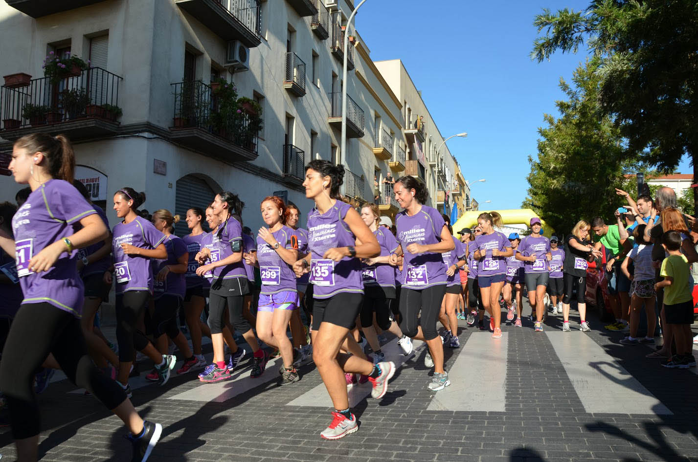
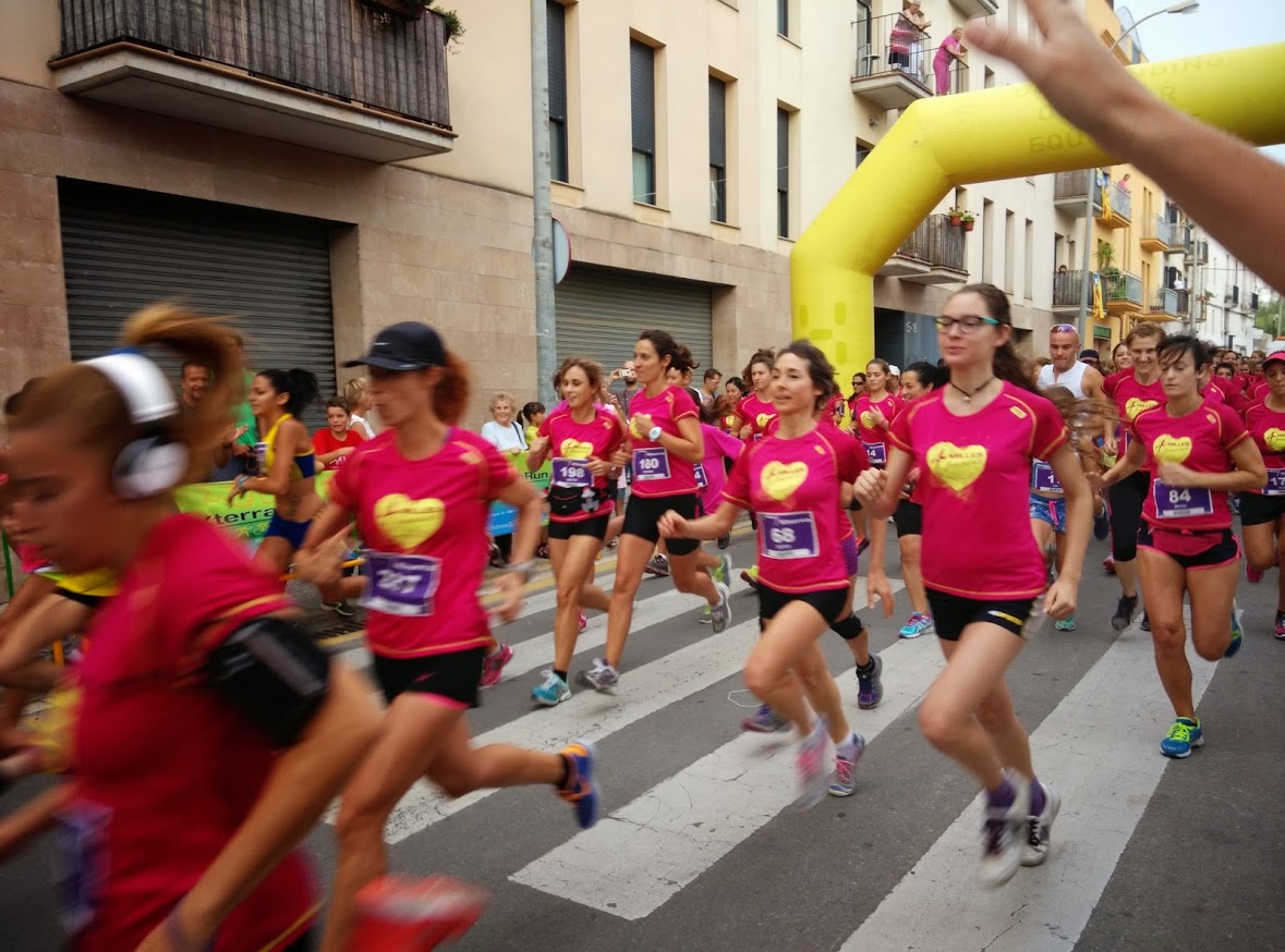
Design and implementation of the visual identity for the race “4 femenines milles” in Vilanova i la Geltrú, Barcelona. The race “4 femenines milles” is a charity sporting event that aims to bring sport to women of all ages. The first edition was in 2013. Until now, each year a different concept searching.
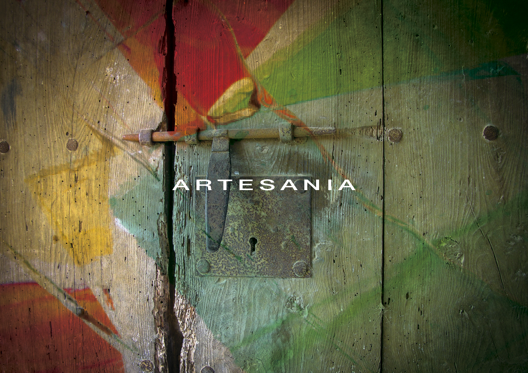
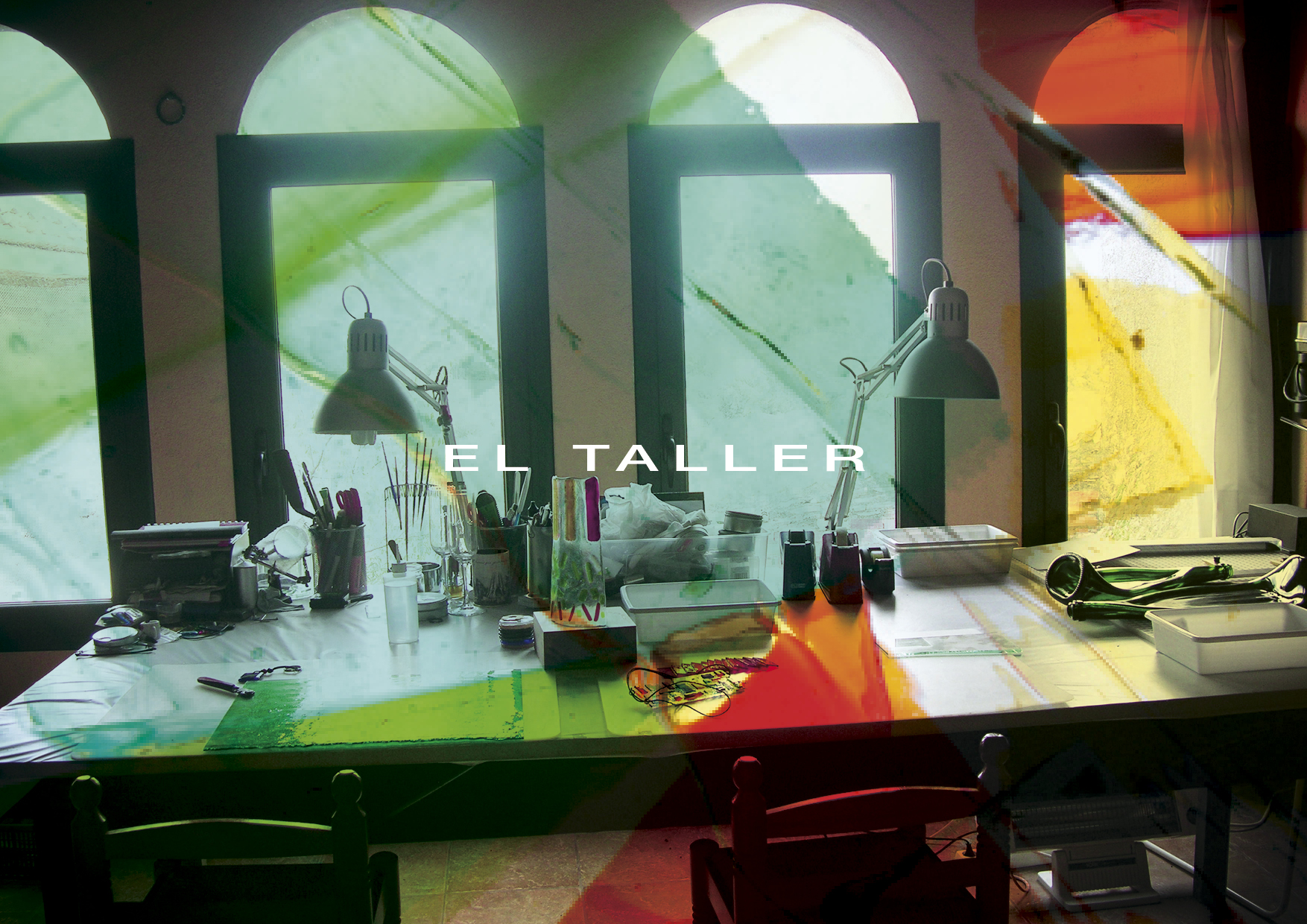
Branding. A&A

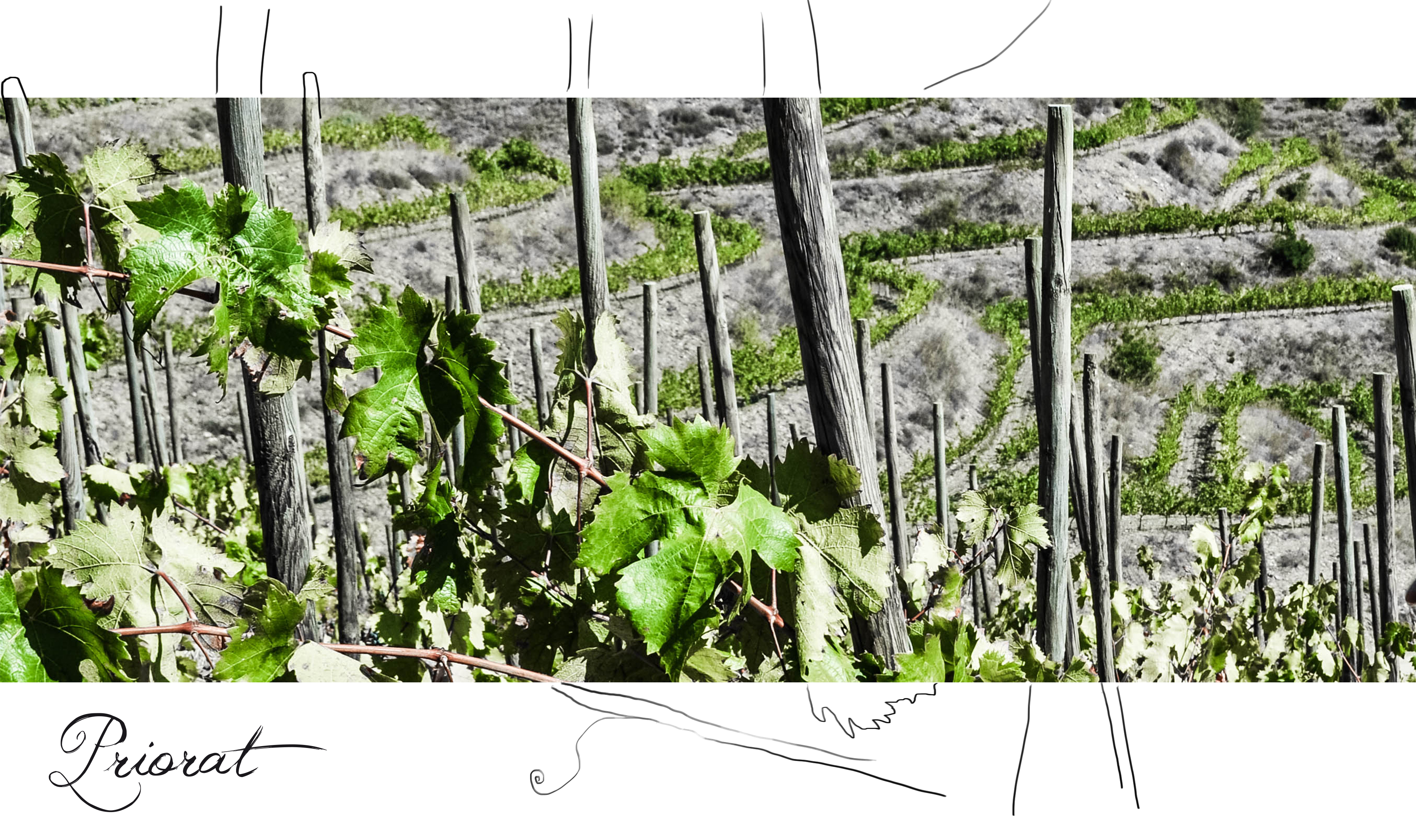
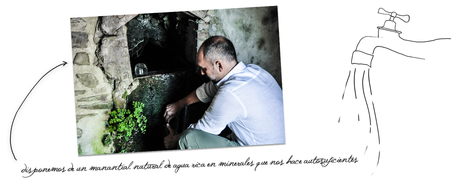
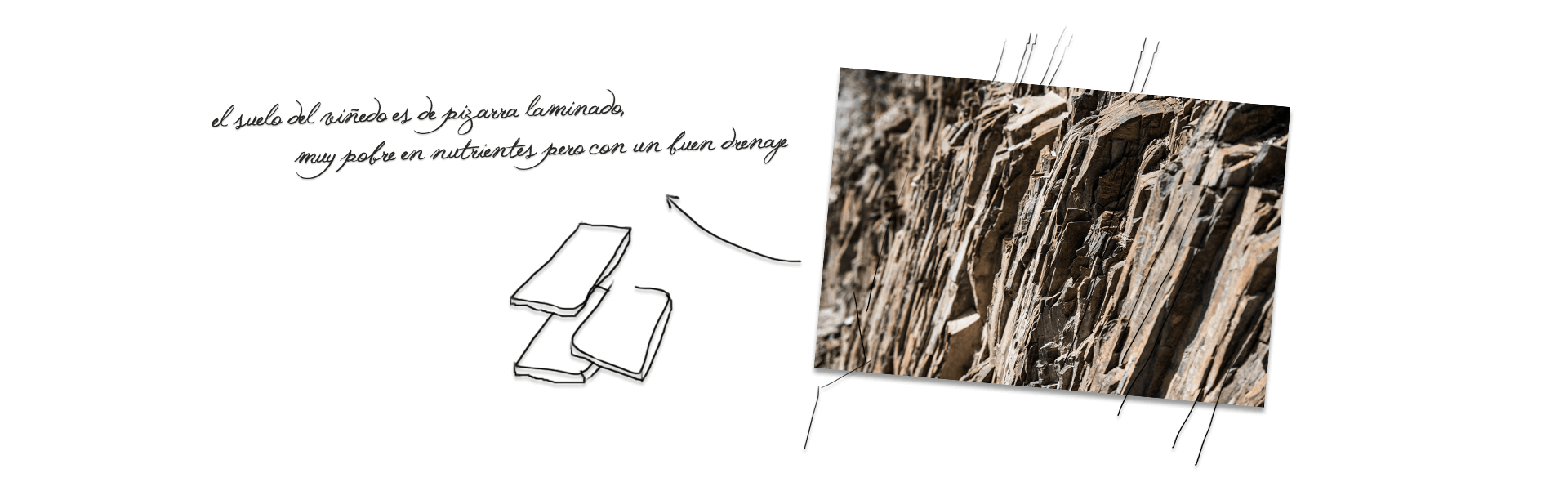
Torres & Earth Brand
![]()
![]()
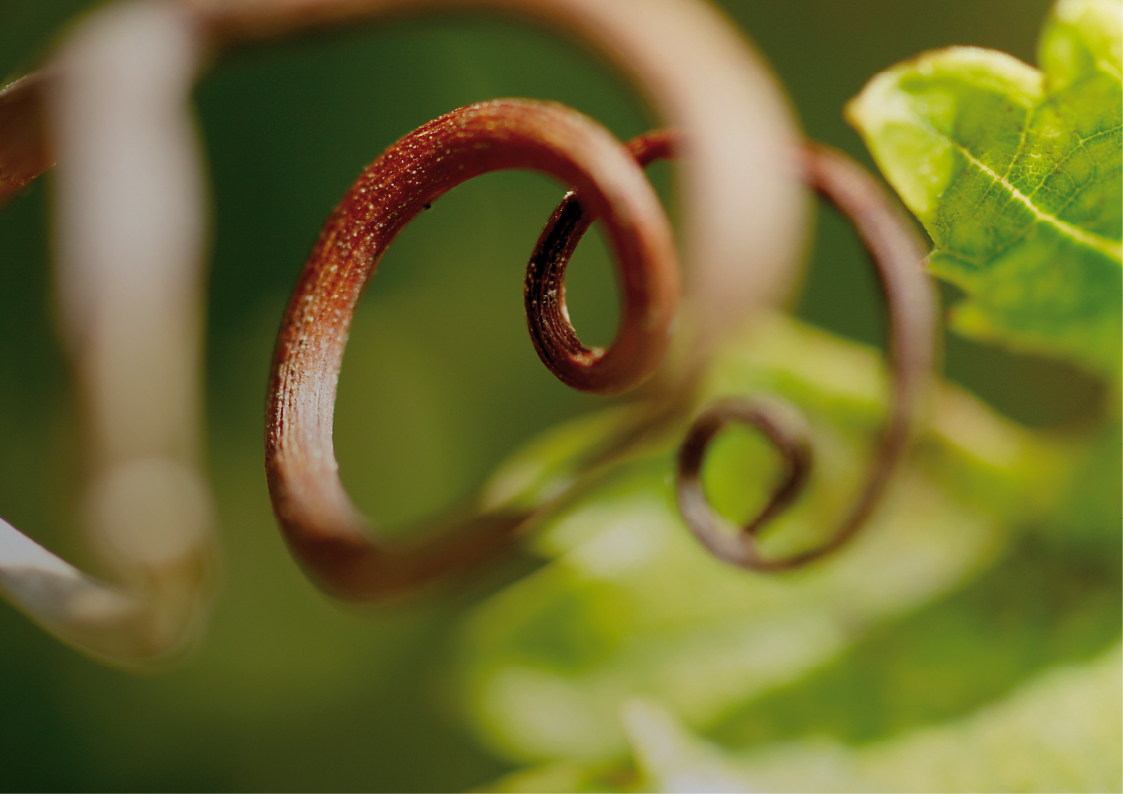
Creation and implementation of visual Torres & Earth brand. Miguel Torres Winery is increasingly conscious of environmental issues. RTCC, the official UN observatory recognizes Miguel Torres as the only sustainable winery. It was decided to develop a parallel identity, a sub-brand within the range of Miguel Torres Winery brands. The message is Torres Winery at one with the Earth.
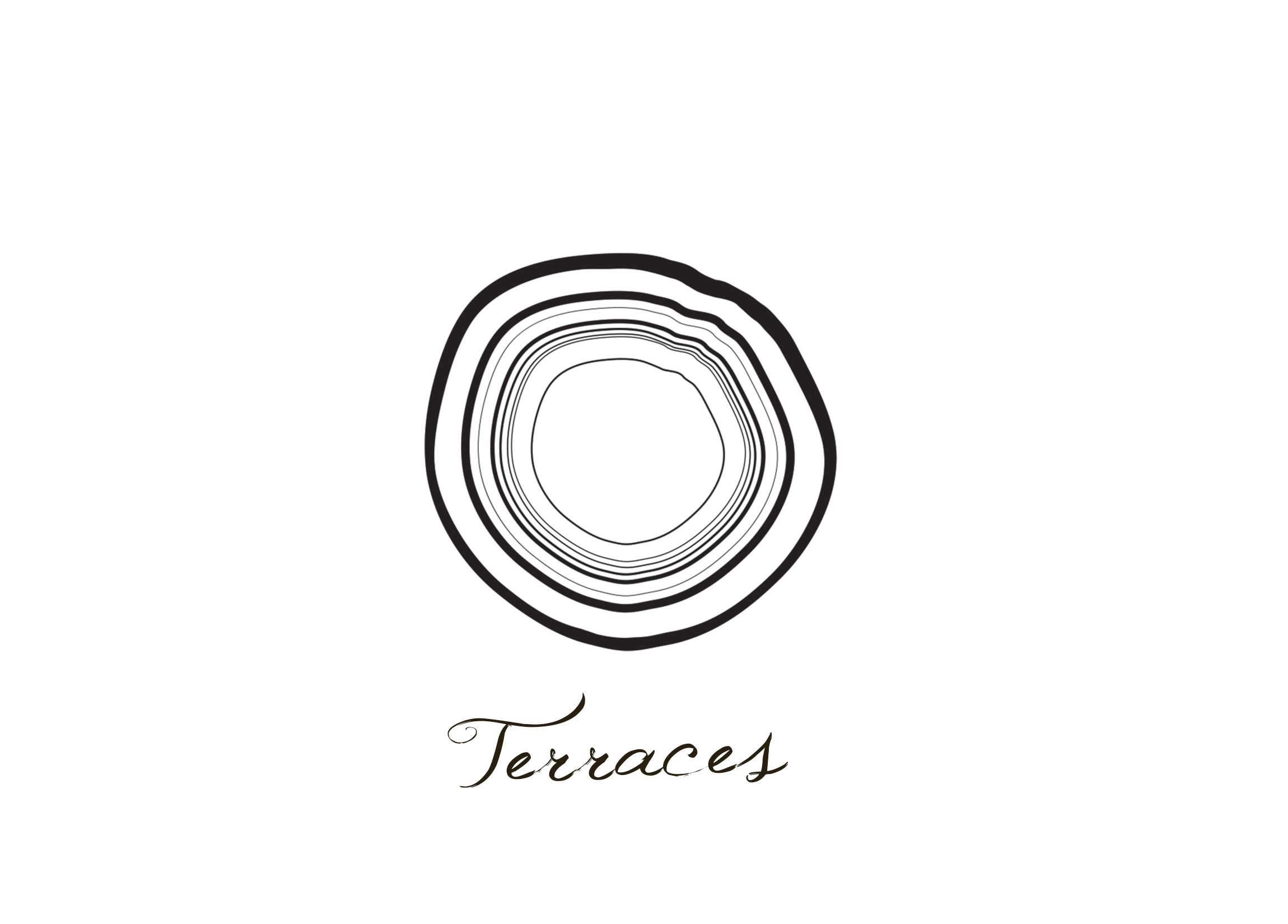
Psychologist & Coaching. Brand
![]()
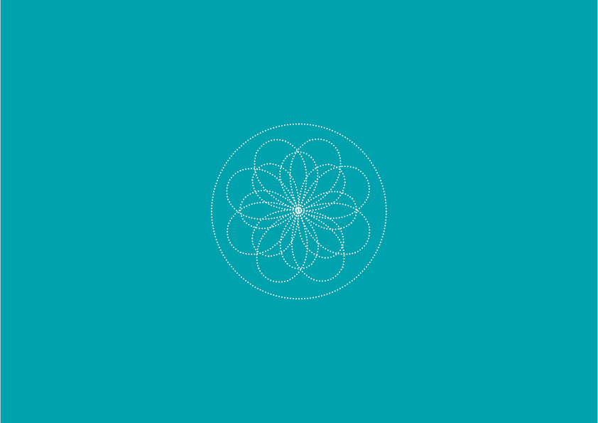
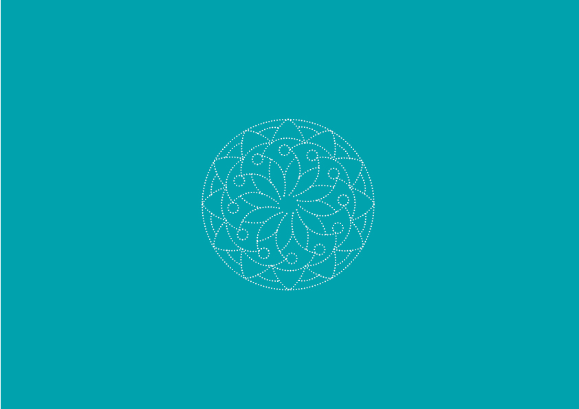
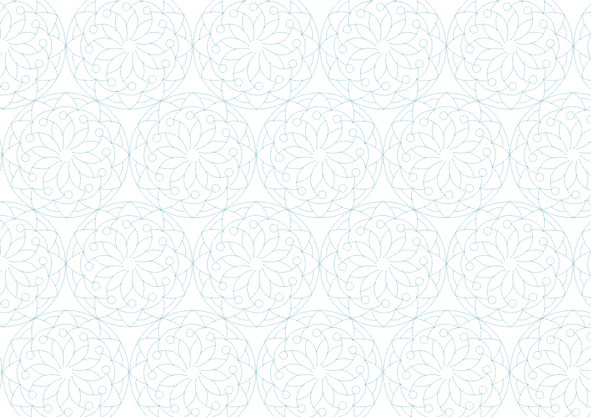
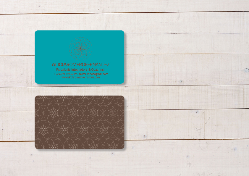
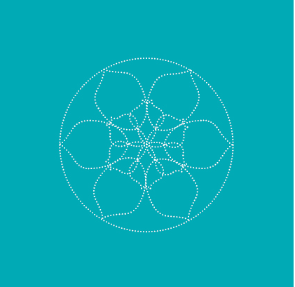
Branding and visual application. The concepts that are associated with the philosophy brand identity are: Flowering, Prosperity, Progress, Development, Growth, etc. The purpose is to make an analogy to the different stages of blooming using balanced concentric shapes.
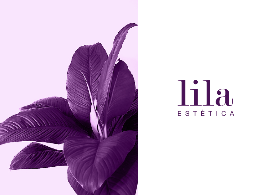
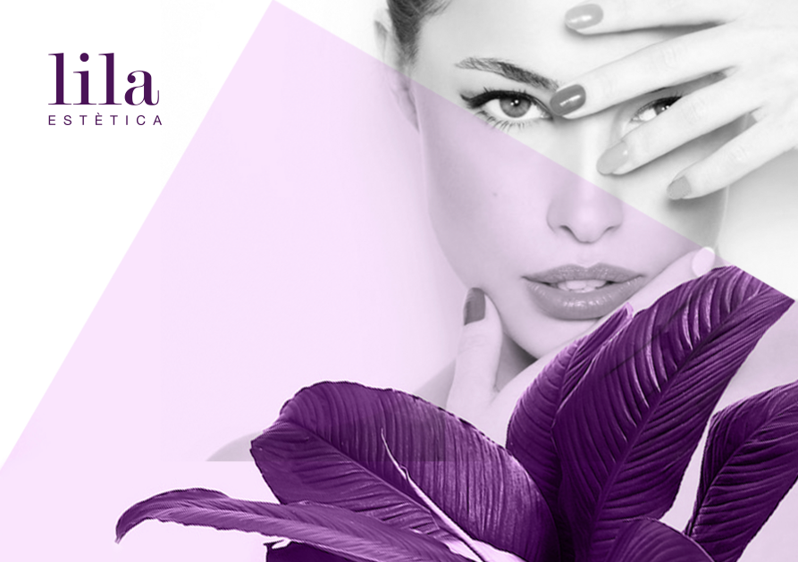
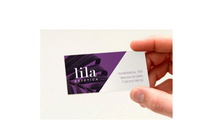
Branding. Pansalud
![]()
![]()
![]()
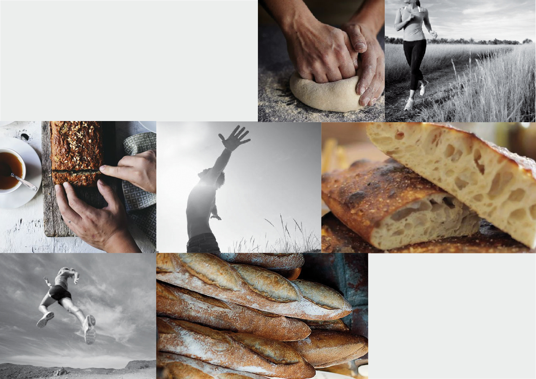
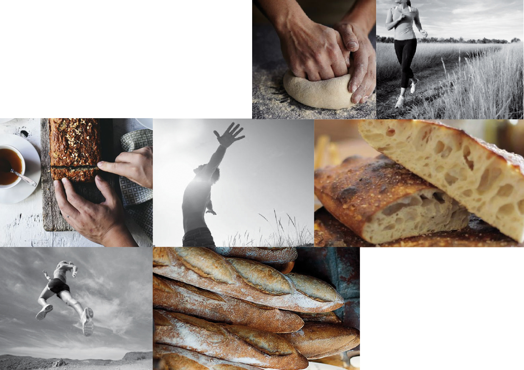
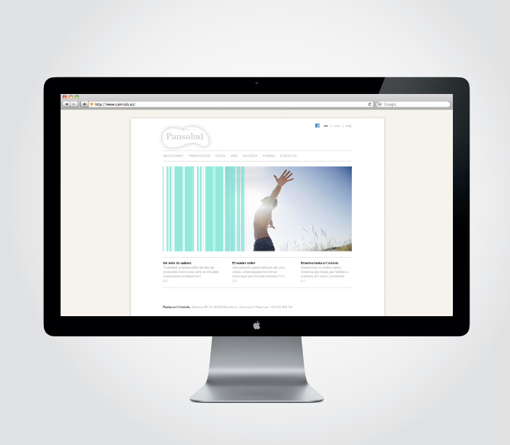
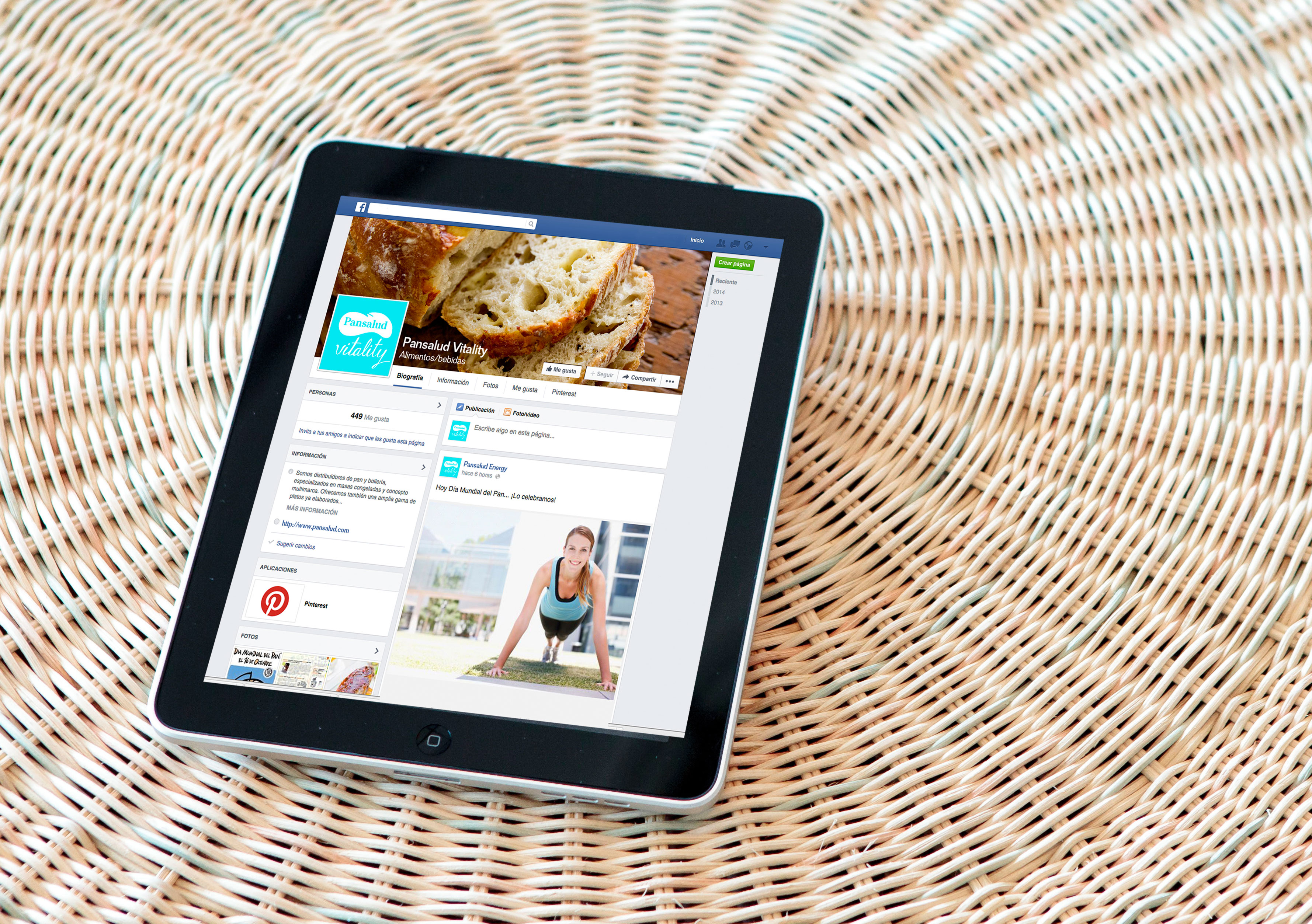
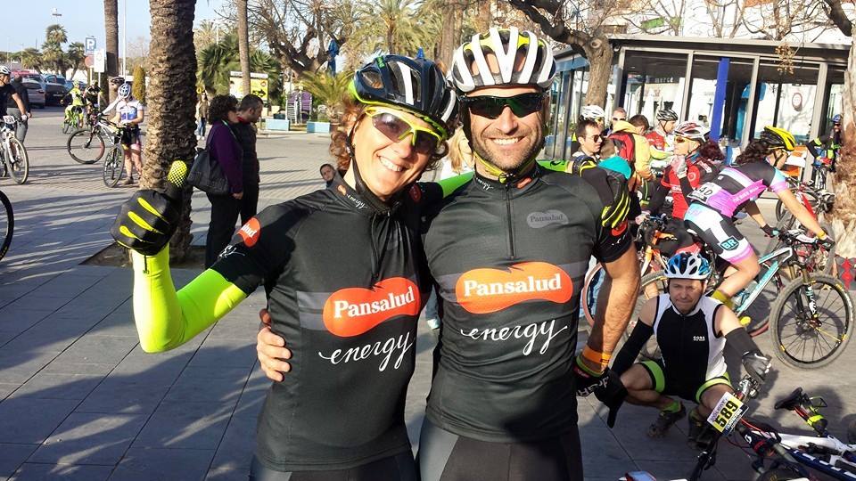
Pansalud, bread for a healthy and balanced diet. Brand creation for Pansalud’s launch. Development of two sub-brands: Pansalud Energy, for people who both play and work hard; and Pansalud Vitality for an everyday healthy lifestyle. Creation of website and graphic design for social media and marketing materials.
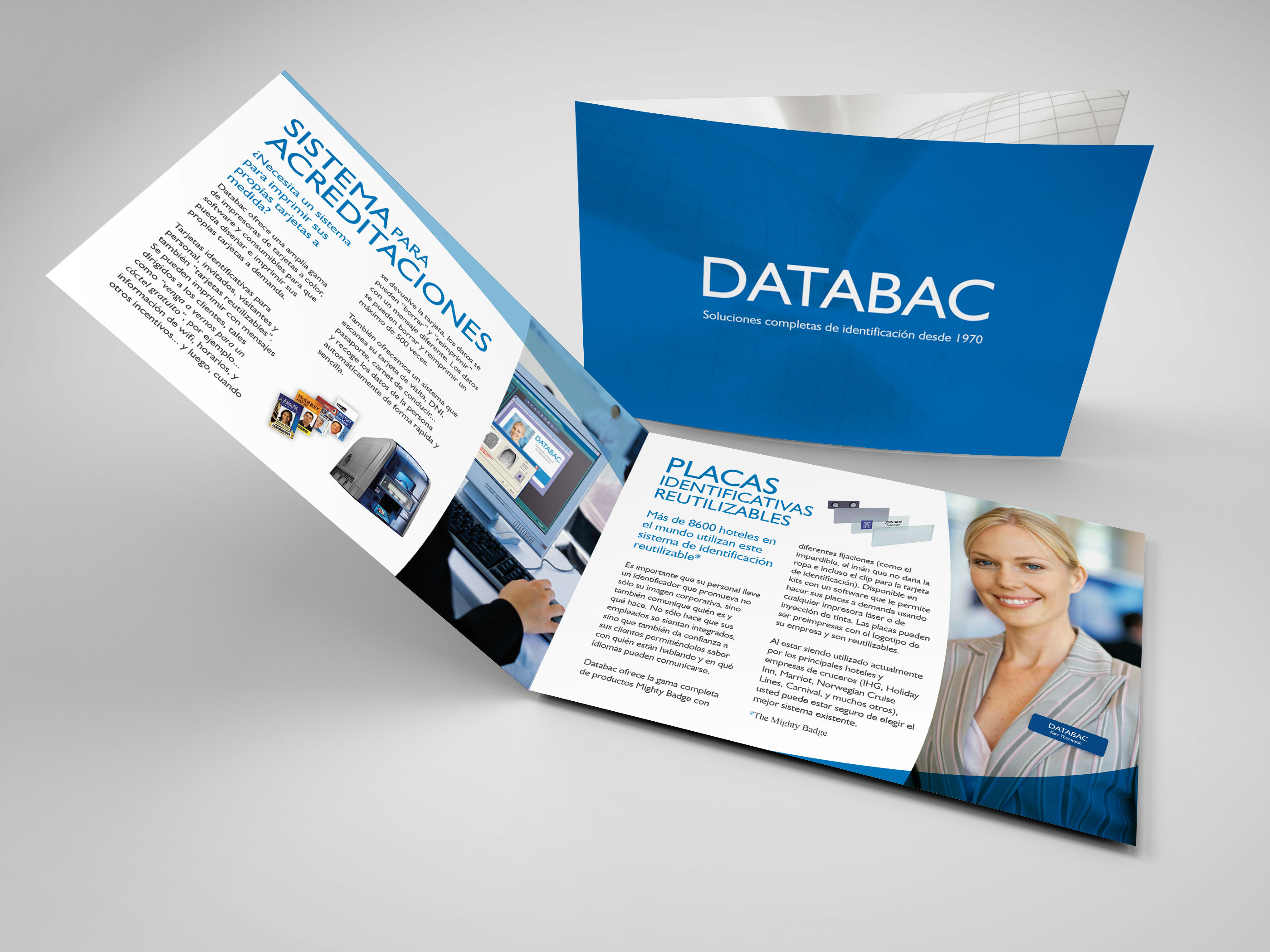
branding Restyling. DATABAC

Corporate Identity. Jemina Albesa
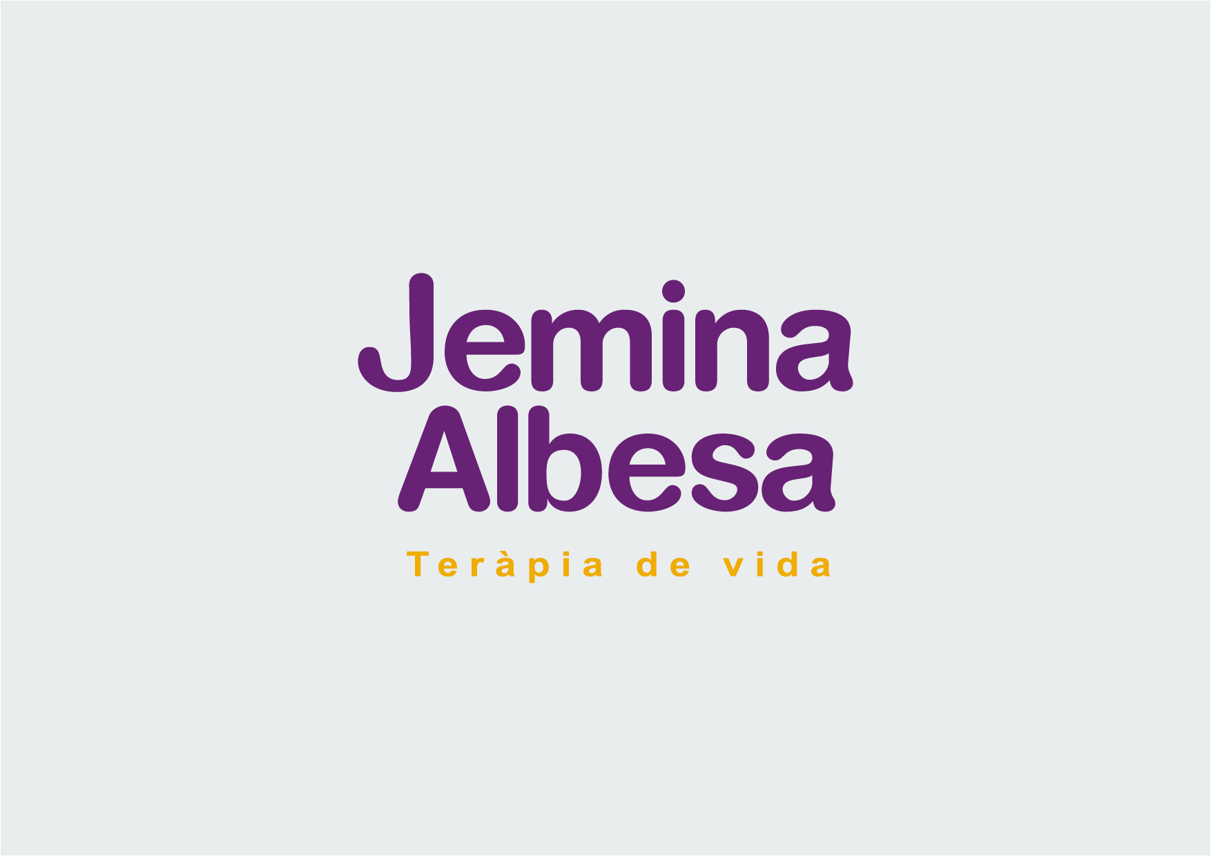
Brand creation and implementation of visual identity for Jemima Albesa, Life Therapy. The identity is based on a symbol that connects earth and sky. It is all tied to the brand philosophy of work. The logo symbol is viewed with a purple and intense mustard, reflecting this identity.
Brand Re-styling. Muñido & Garrido
![]()
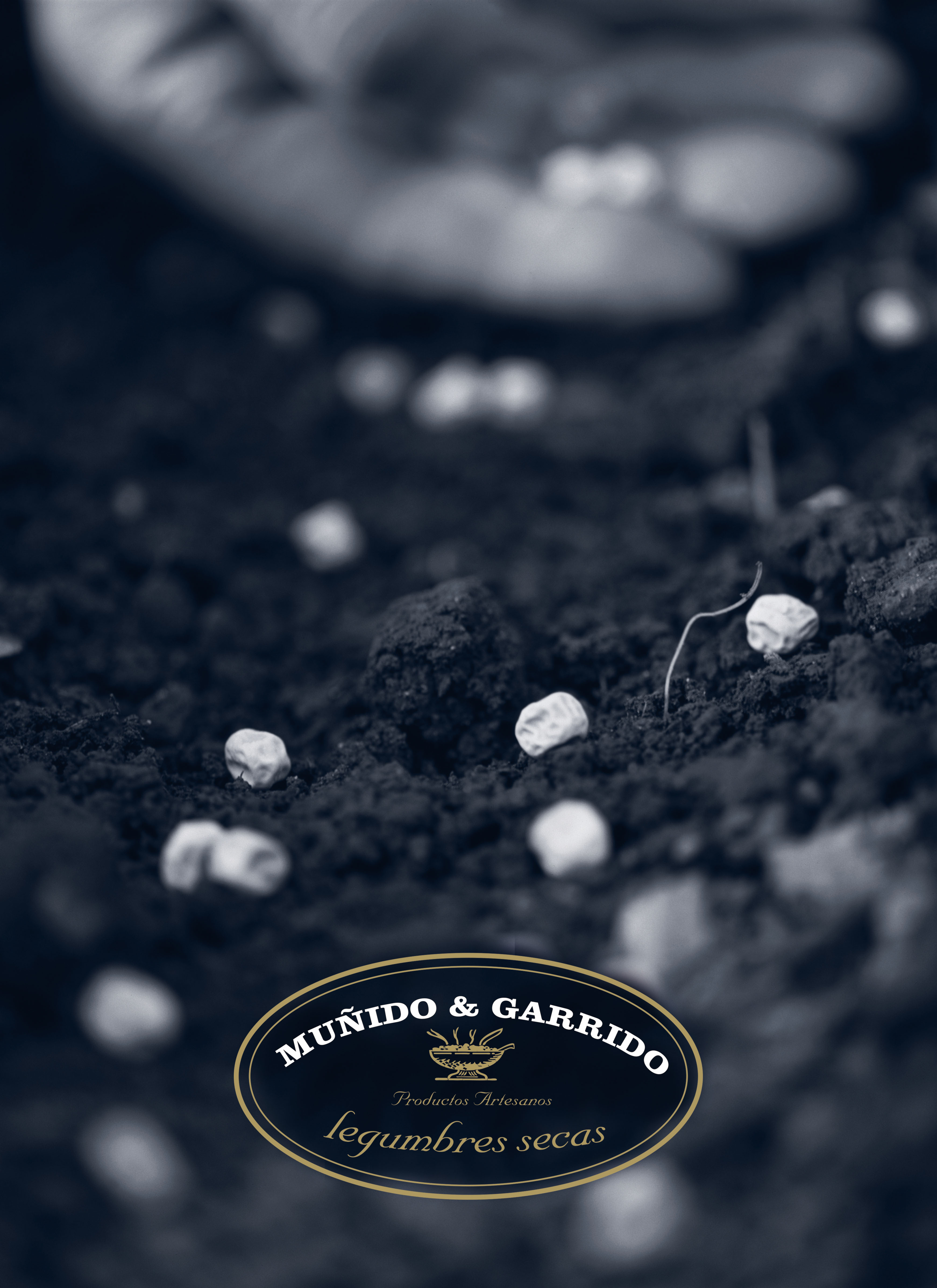
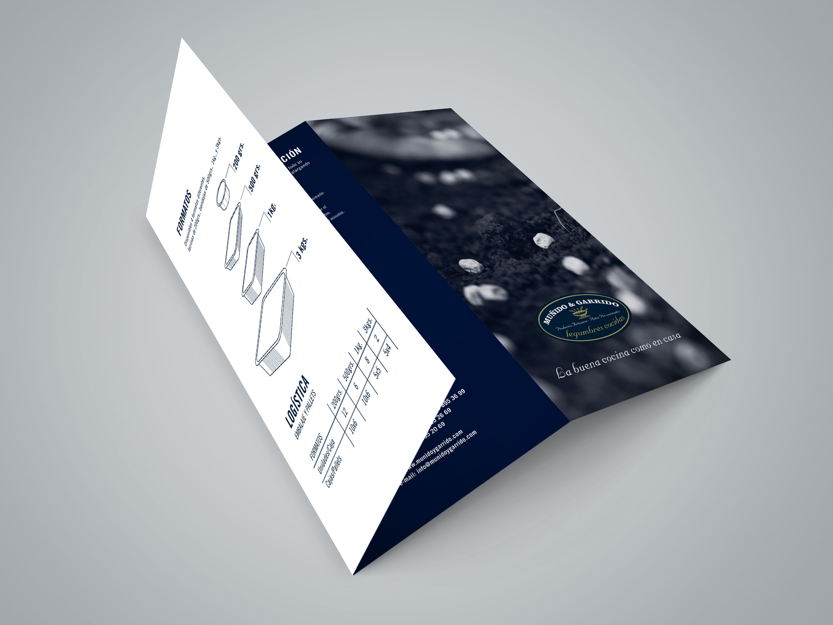
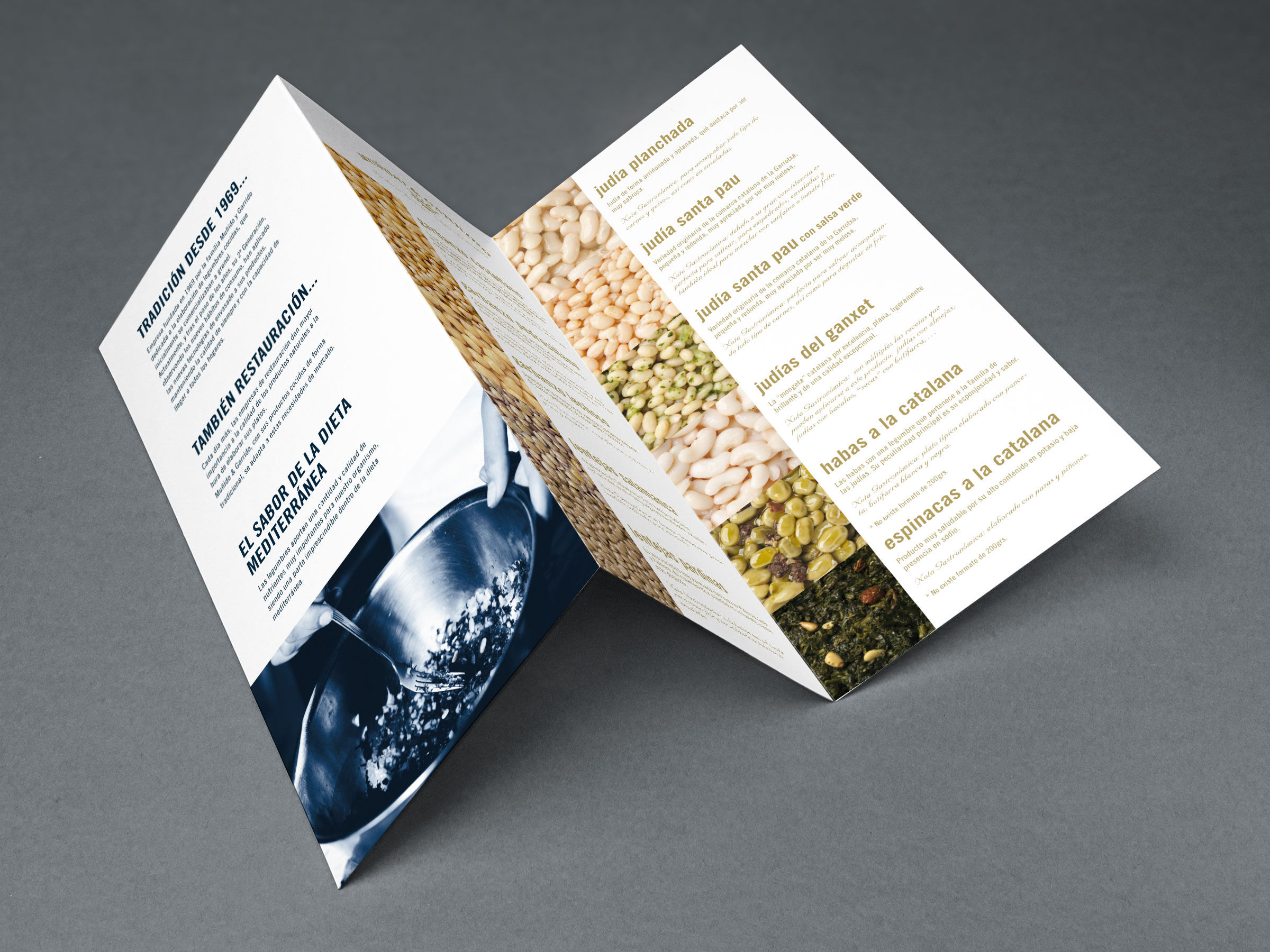
Re-styling of MUÑIDO & GARRIDO Brand which is a family business founded in 1969, dedicated to the production of raw and cooked vegetables. The redesign reflects a change in the orientation of the brand giving it a new position in an increasingly relevant market, but maintaining the core values of the brand: family tradition, quality workmanship, handicrafts and Mediterranean diet.